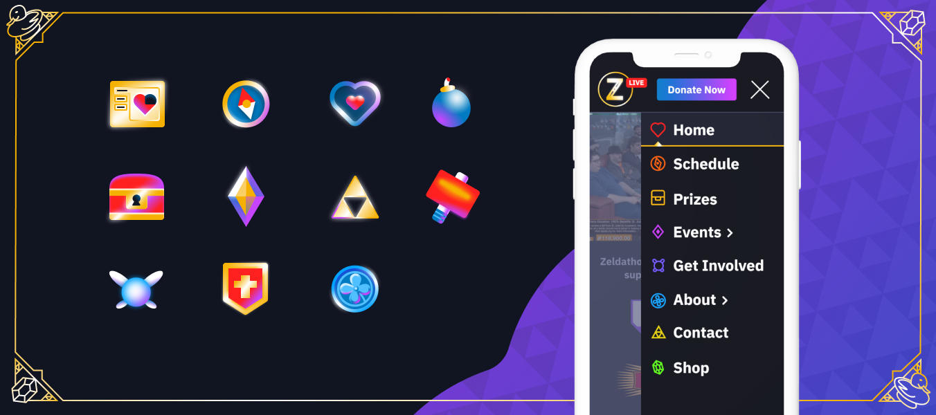
Zeldathon has raised over three million dollars for charity since its inception in 2009. My goal was to give the website the polish and professionalism it deserves while also synthesizing the team's personality and Zelda aesthetic.
My favorite part of this project was creating bright and dynamic illustrations, patterns, and photo collages. The color palette started to come together when I experimented with the gold gradient (a nod to the Legend of Zelda). Purple is complementary to gold, and blue and purple are analogous. I wanted to introduce even more color, so I went with the rainbow for the nav icons (ROYGBIV). These bright colors provide optimal contrast with the navy background color, which is important for folks with visual impairment.
The content strategy, site structure, visual design/branding, web and mobile design, and prototyping took me over a year to complete. There are over 30 planning and wireframe pages detailing 14 web pages of content across various different activity states. My time was spent talking to the community, longtime teammates, leadership, and digging through a decade of media before putting pixels down in Figma. In addition, there are several different design states of the website depending on the situation: During a marathon, pre-marathon, and off-season.
One of my favorite easter eggs referencing the Legend of Zelda is on the FAQ page. No matter which option you click, you'll be sent back to the top to read it all again.
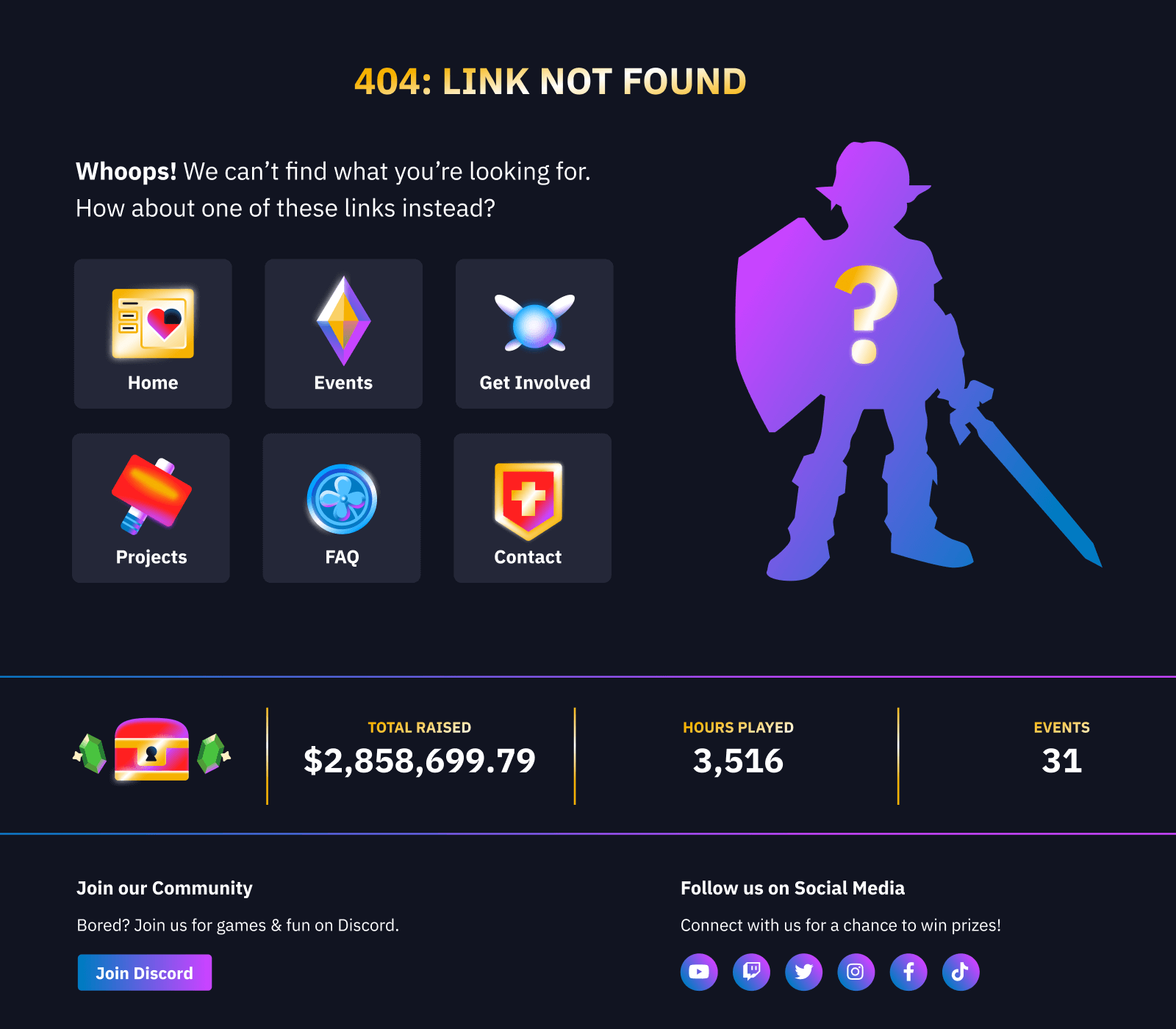
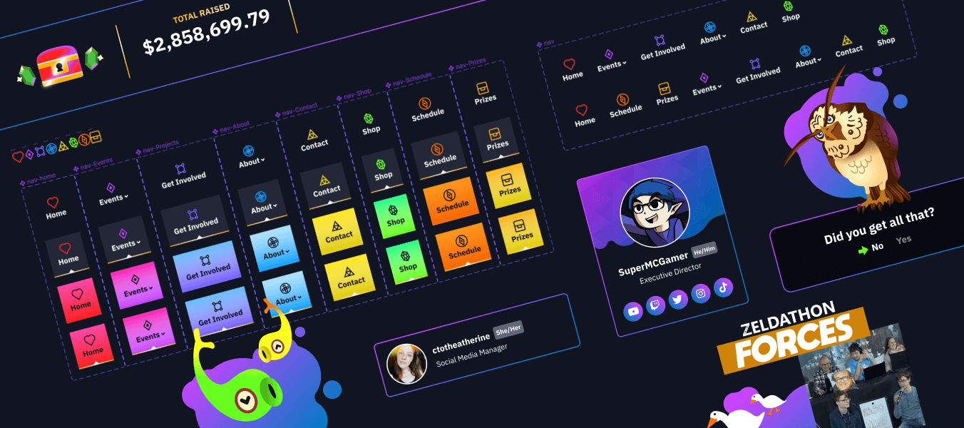
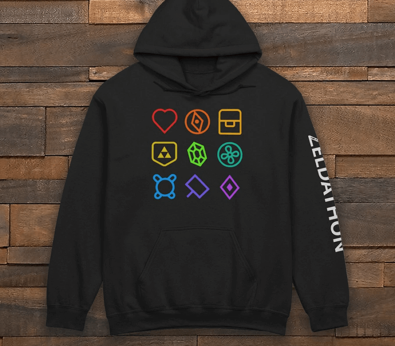
Feedback after the launch was overwhelmingly positive: our community and team love the visual refresh. In the middle of this project, a formal Design team was created for our org. Two Graphic Designers, Eric and Dark, extended the colors and branding elements I created to the Twitch extension, social media marketing, and, most recently, merchandise. I also made special, small-scale versions of my illustrations to use as role icons for our Discord server.
Our Directors also noted that they're getting much more contact form submissions from charity reps and sponsorship partners as a result of moving the contact form to the main nav. Our community appreciates the new "Donated by" credit they receive on the prize page, too.
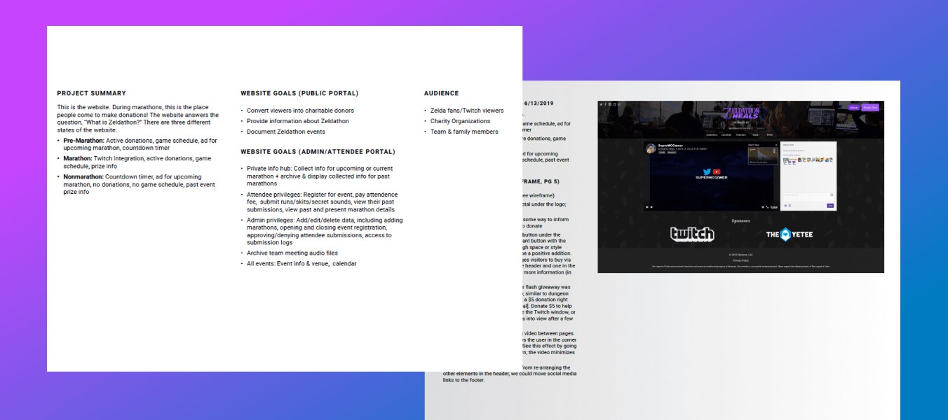
After meeting with stakeholders and surveying the community, I put together the first planning document. Download the first draft
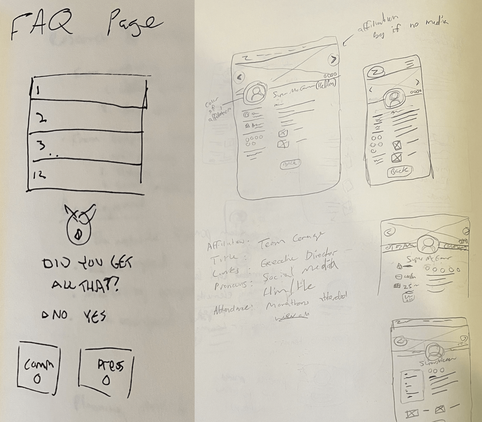
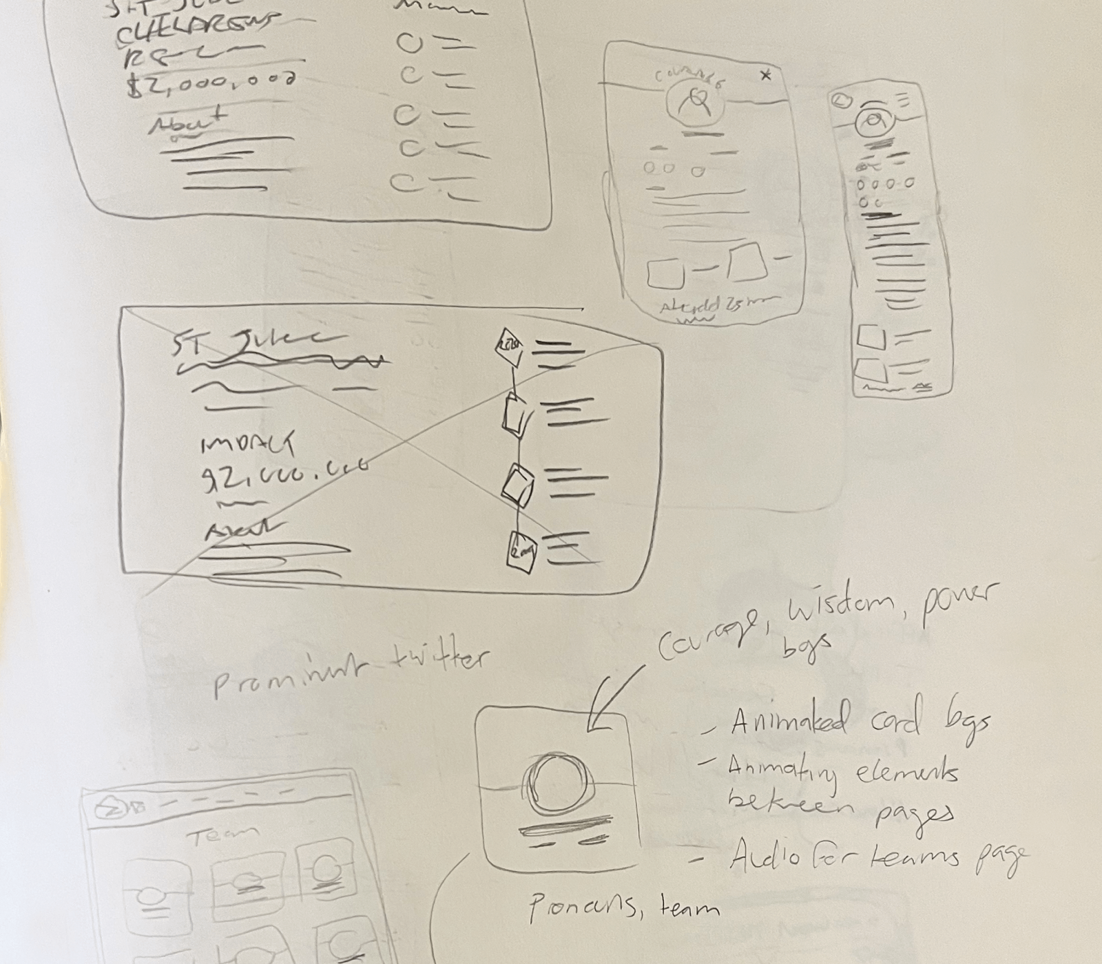
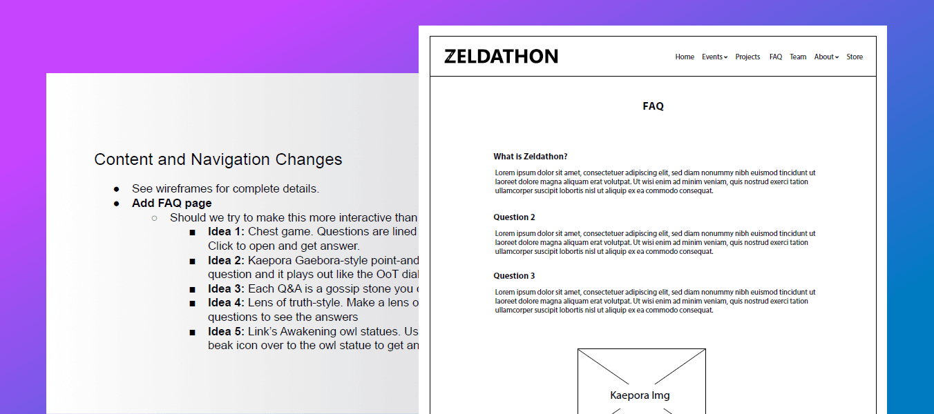
I collected and wrote all of the content/ideas based on our overarching goals – continually editing wireframes as ideas evolved. Wireframe Doc
I dove right into the design after months of planning. I wanted to test a few different interactions, so I built a quick demo with HTML/CSS/JS. Ultimately, I thought this early design lacked imagery and adequate color. One element that did make it into future iterations was the blue/purple gradient – and the final colors are all WCAG-compliant.
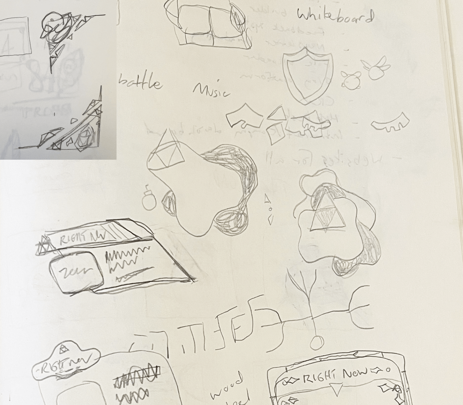
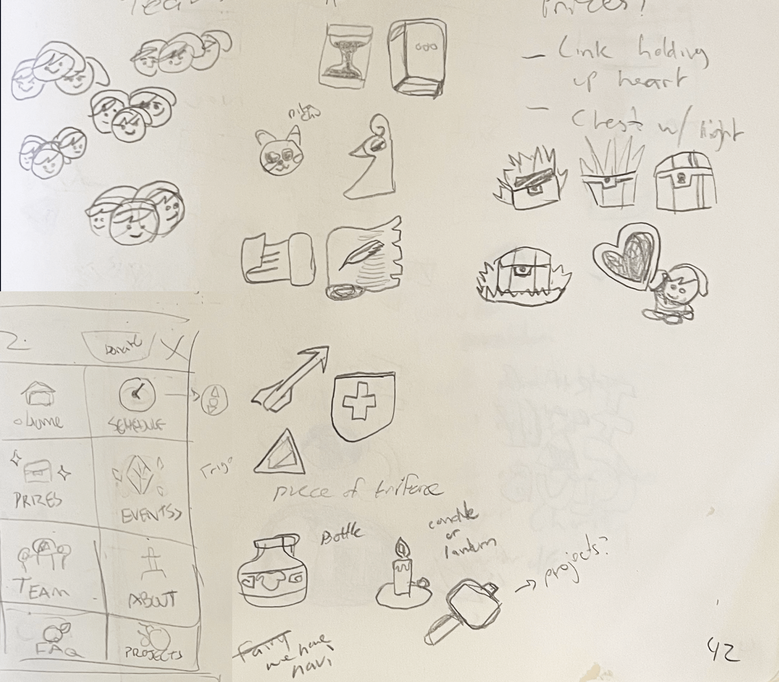
I went back to sketching ideas after my first crack at the visual design. I knew I wanted to introduce more color and that I wanted to incorporate gold because it's a classic Zelda choice. I also knew I could introduce more color if I made icons, so I got to work! Once I made these masthead variations, I still felt like there wasn't enough color. Side note: the events nav got cut in development, but it may make a return in the future as we get more hands on deck to help with the archival pages.
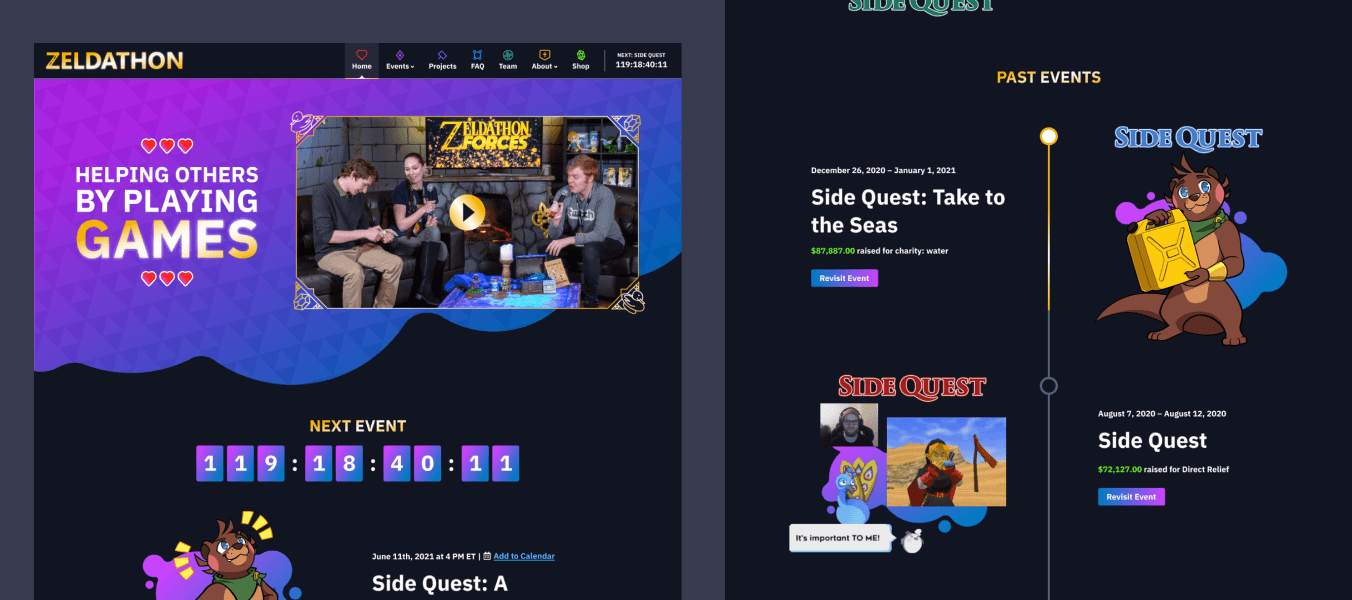
Leaning into the gradient and gold, I brought in one of the other elements I sketched out: blobs. I also overlaid the triforce pattern I created over the full-width blob sections. The design really started to come together at this stage, so I applied the elements I created to the rest of the content pages.
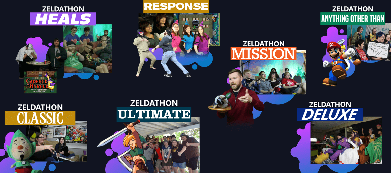
One other fun thing I took on was collaging media from each marathon together for each event call-to-action. The logos by themselves don't convey the chaotic fun of each event, so I decided to collage photos and game art together to better represent the events. As of July 2022, there are 32 events and counting (and an equal number of collages).