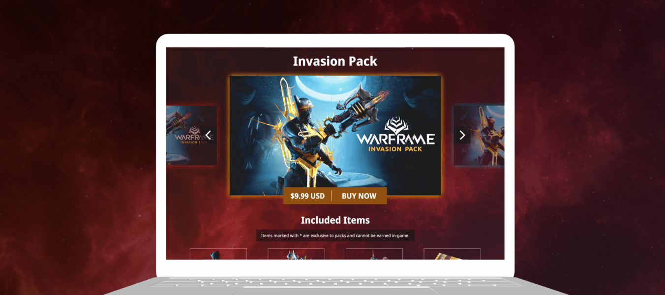
With each game update comes new item packs to help players on their journey. The project goal was to create a template that could be used for each update and be highly interactive and visually engaging in order to attract players.
Our goals for this redesign were to increase engagement and better showcase the items for sale.
This page redesign took about one week for Design and two weeks for development and testing. My emphasis on prototyping in Figma streamlined in the handoff process.
Purchases increased by ~21% during the first month. The average time the users spent on the page increased to ~two and a half minutes. From a design perspective, packs are much easier to compare now that the items are subtracted and added as you click through them. Lastly, with the template created in Figma, swapping out content with each update is a breeze.
Finished, fully-developed website demo. Launch site.
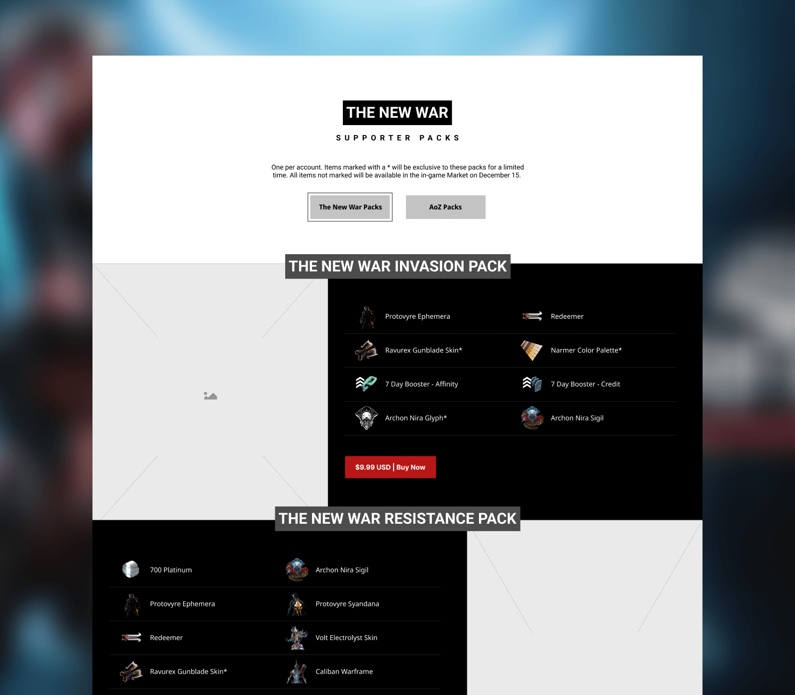
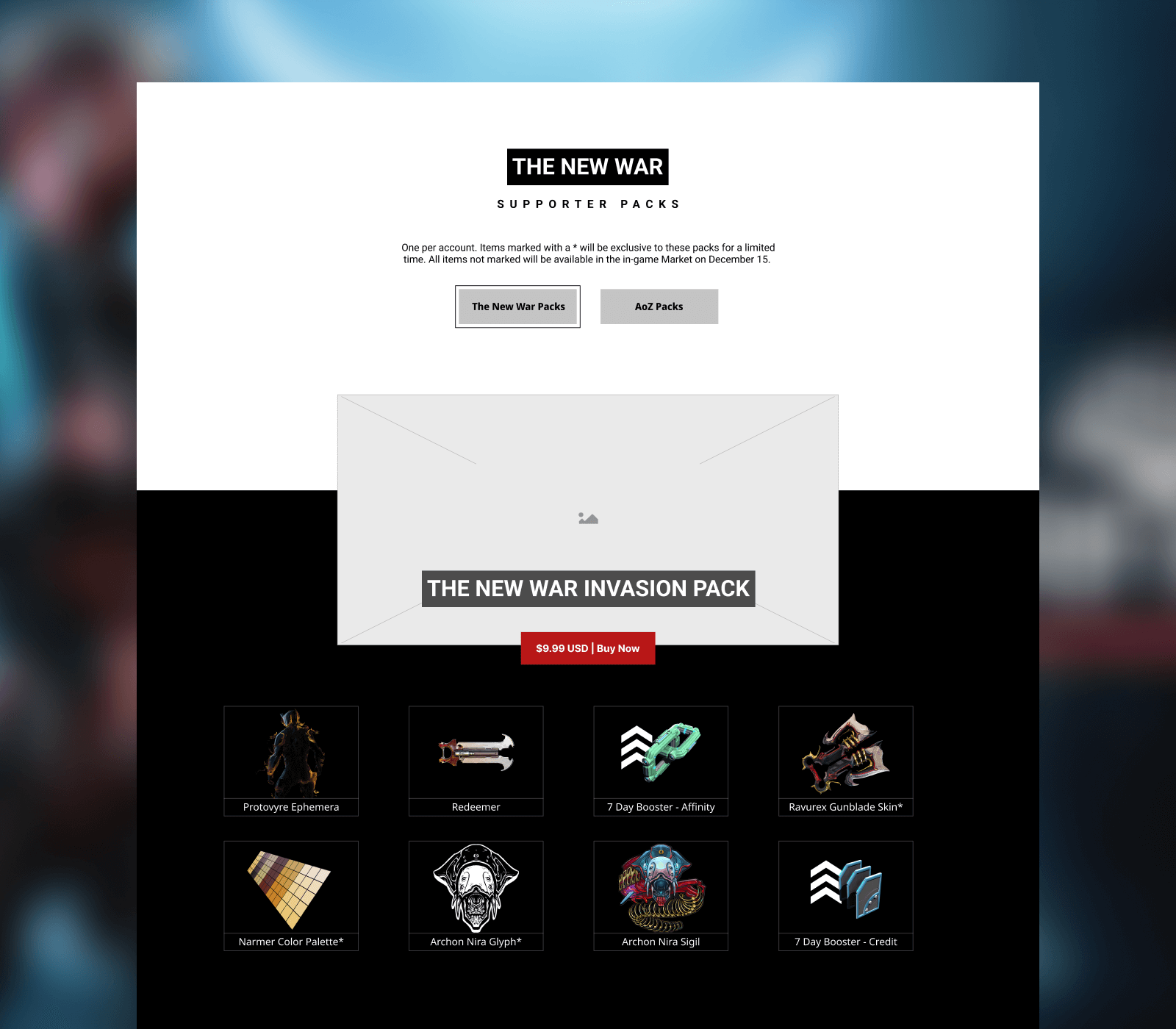
Some of my earliest ideas were single pages that bumped up the image size and helped separate packs into more manageable chunks.
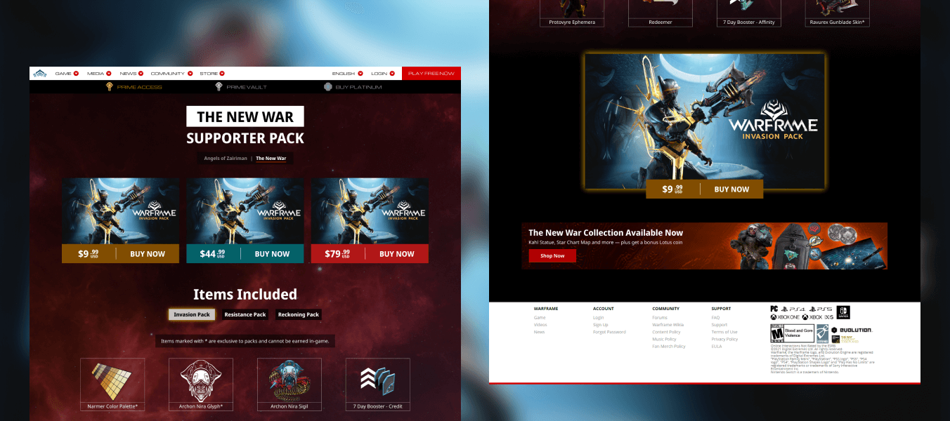
In the visual design phase I tried a few other ideas, iterating on the 2nd wireframe. This concept was more interactive, but still a bit busier than we'd like and pushed content down the page.
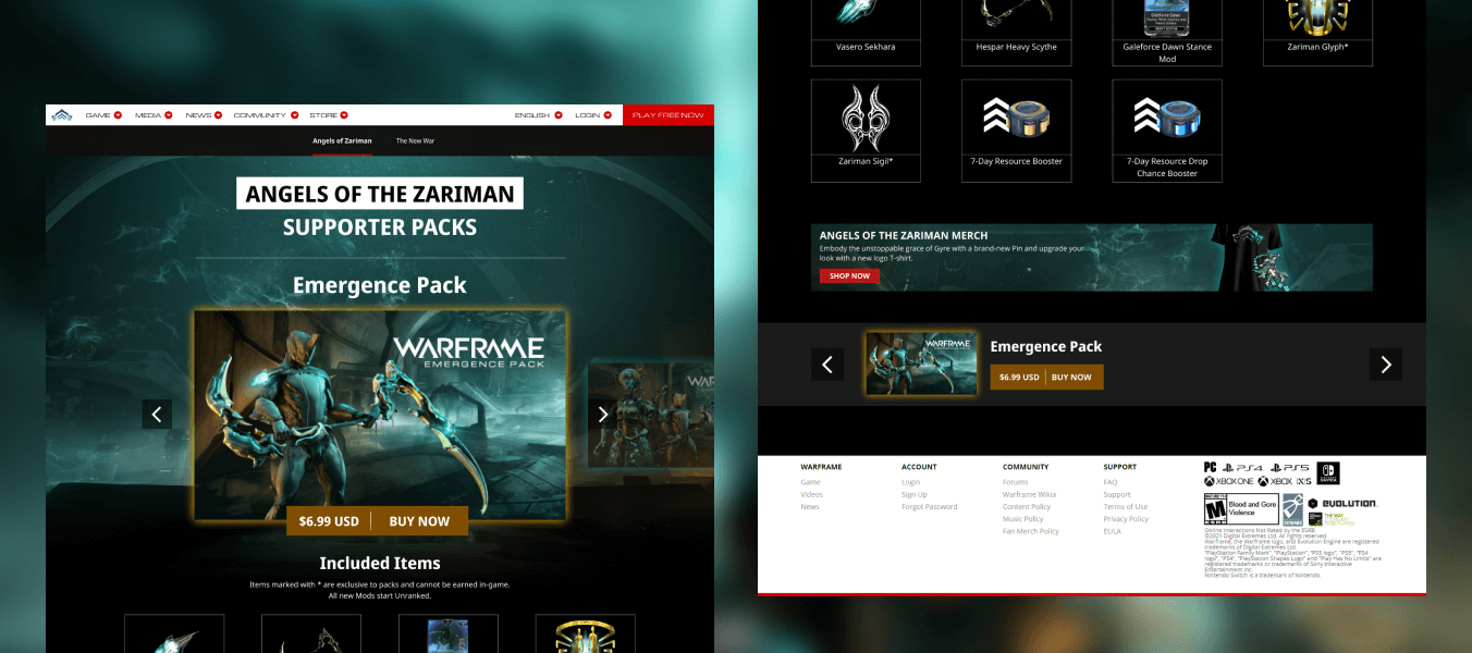
The final design supports asset swaps as new packs are launched, as well as any quantity of items and packs. This makes the design resilient against future content.